Blog
Transforming the BONE brand image – the logo
In 2023, BONE Drums began working more closely with Peter Bratušek (Start:up Slovenija mentor), also our current partner in business development. Through this collaboration, Peter has been discovering our mission, the vision of our company, and the brand we’re building, along with our products – BONE drums. Concurrently, he’s observed how our work’s results are perceived, accepted, and utilized by our customers – drummers.
To gather as much useful data as possible, we began with a brief, straightforward survey of BONE News subscribers. Additionally, we visited and spoke with key retail stores where BONE drums are available. We quickly discovered that the product’s quality, craftsmanship, appearance, and sound are highly valued and recognized. However, it was shocking to find that brand recognition was rather very low.
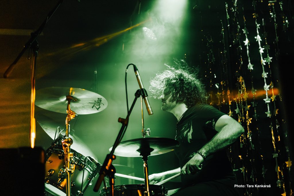
A similar response came from sellers, with the added comment that the brand’s graphic identity (the “skull” icon) was in some cases quite distracting, actually hindering rather than helping sales. Specifically, while BONE drums are fully competitive in quality and sound with the most renowned manufacturers in the industry, and thus attract the interest of demanding, established musicians, the brand’s logo unfortunately appeals primarily to younger individuals (even teenagers). As a result, they weren’t making expected purchases. The feedback we received was, “Nothing special. It just bothers them.”
On the other hand, the premium price, which is justified, prevented those attracted by the logo from making a purchase. For them, the price was too high.
Therefore, a clear (and necessary) strategic decision was made by the company: to change the graphic identity of the BONE brand.
The joint decision
Given that the company has a very clear vision, capability, and potential in the target market, along with well-defined target customers that remain consistent, we focused on the highlighted issue: the presentation and communication of the BONE brand image.
Specifically:
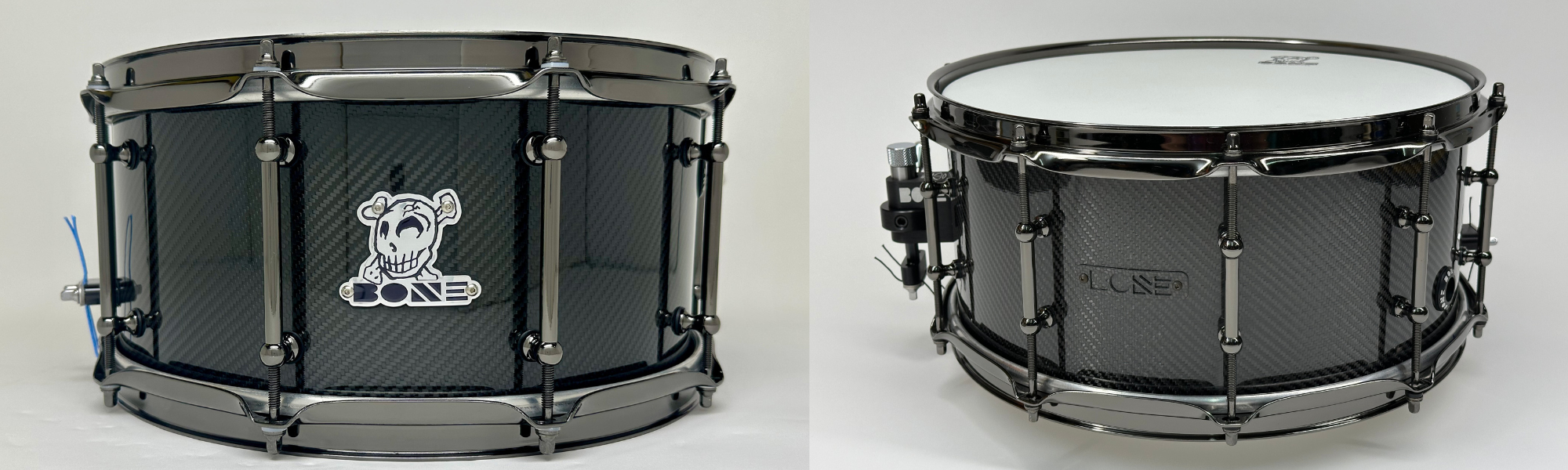
- The name and image, which become the logo, are retained: BONE.
- The BONE logo is enlarged, maintaining its design as the brand’s graphic mark, and it appears in a single color.
- Only the BONE logo appears on the products; the product name (e.g., Aluminum) can optionally be added.
- Whenever possible, the badge (mark) on the products uses the same material as the products themselves (e.g., TRUE Carbon – carbon, TRUE Carbon Hybrid – carbon and wood) or is even integrated into the product (TRUE Carbon).
- In advertising materials, a black or white logo is used, and “· DRUMS · est. 2005 ·” is added whenever possible.
The company is currently in a transitional period, so the old logo is still in use. We believe this is understandable, as drums are not mass-produced items, and therefore, time is needed for the transition.